
There’s always something nostalgic about flipping through an old shoebox of prints. Some photos come out blurry, others catch people mid-blink—yet each one tugs at you in its own way. But shift those same images onto the page, framed by crisp white margins and given room to breathe, and suddenly they transform. The messy becomes intentional, the casual feels curated. The result is sharp, purposeful, and almost reminiscent of a summer fashion spread. That’s the art of photobooks: they don’t just store memories—they style them.
Check Out 10 Tips for Creating Photobooks That Feel Like High-fashion Editorials…
#1. Start with a Story, Not a Sequence
Forget strict timelines—your phone already handles that. Photobooks don’t begin with “Day One of the trip” and end with “The flight home.” Instead, they start with a mood, a feeling, a narrative thread. The question isn’t: What do these photos show? But what do they say? Maybe you’ve got beach shots, bustling cityscapes, or intimate portraits.
Don’t scatter them randomly. Instead, group them by mood, by color, by light, or by emotion. That becomes your story—your theme, your entry point into how to create a photobook that feels curated and intentional. If it helps, jot down a short phrase, ten words or fewer, that captures the mood. That note will anchor your photo selection and shape your layout. Because in the end, you’re not just arranging pictures; you’re building rhythm. You’re creating flow.
#2. Choose Quality, Not Quantity
You don’t need endless fonts, stickers, or filters. Restraint is your best design tool. Choose one typeface, two at most, and pair it with clean backgrounds in white, black, or grey. Simplicity doesn’t dull impact; it sharpens it.
And when it comes to printing, don’t cut corners. Thick matte paper and lay-flat binding elevate your book instantly. The goal is to create something that feels as if it were left behind at a boutique hotel—tactile, polished, quietly luxurious. Because in photobooks, the object matters as much as the images it holds. If it feels cheap, it reads cheap, no matter how strong the photographs inside.
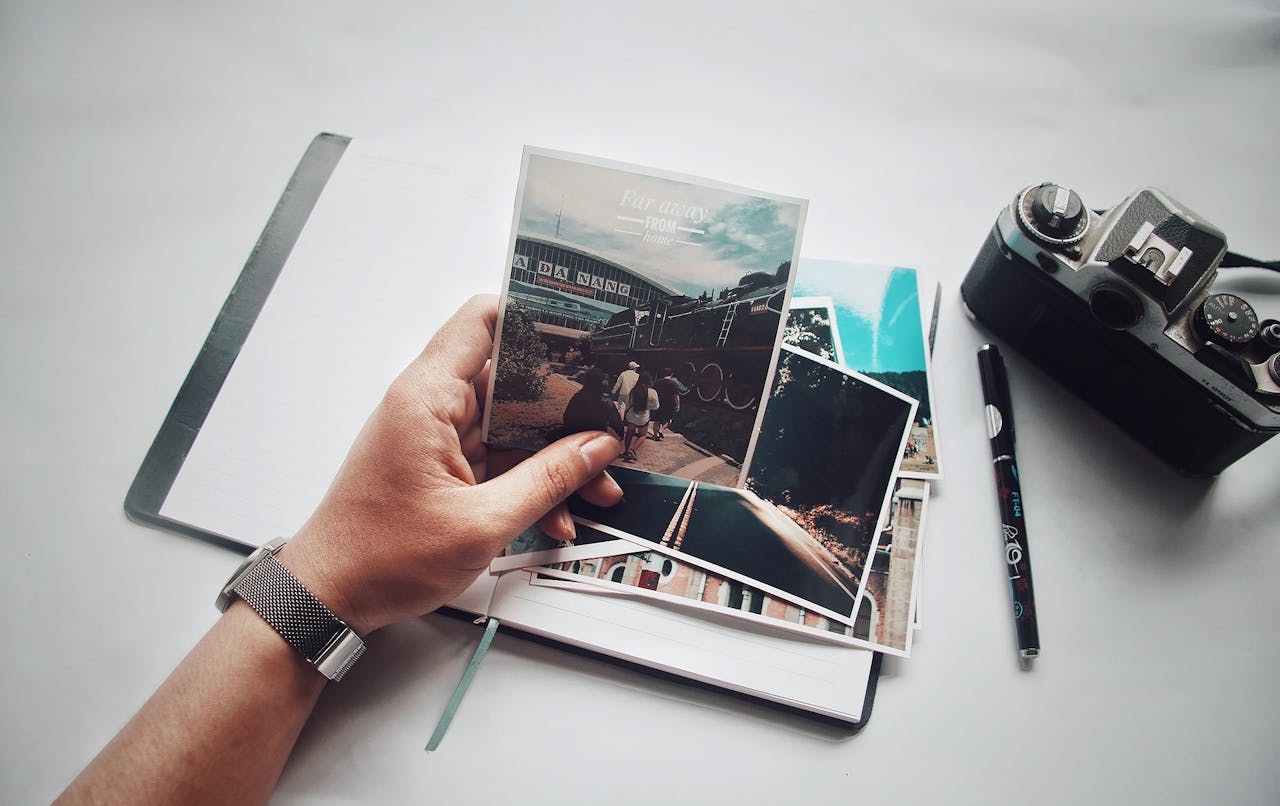
#3. Prep Like a Pro
Before you dive into design, prep your files. Start by digitizing your best shots—whether they’re tucked in albums or scattered in shoeboxes. A quality album scanning service makes all the difference. It’s not just about preserving the past; it’s about securing crisp, high-resolution images that are sharp and color-corrected.
Clean scans give you freedom. You can crop, zoom, and experiment with layouts without losing quality. Skip this step, and you’re essentially working with bad ingredients. The bonus? Many services now let you preview scans online, giving you an early spark of inspiration for your layout.
#4. Keep It Editorial, Not Sentimental
This step can sting: separating personal value from visual value. A photo that means everything to you may not belong in the book. Photobooks are about design, not just memory.
Think of it this way. Your goal is a piece you’d proudly leave on a coffee table. Something a guest could flip through and enjoy, even without knowing the people inside. That means choosing images that speak through form, color, and composition, not only emotion. Make changes confidently. And if you’re unsure, ask a friend with no personal connection to weigh in. You might be surprised by what resonates most.
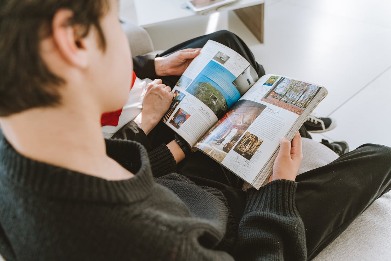
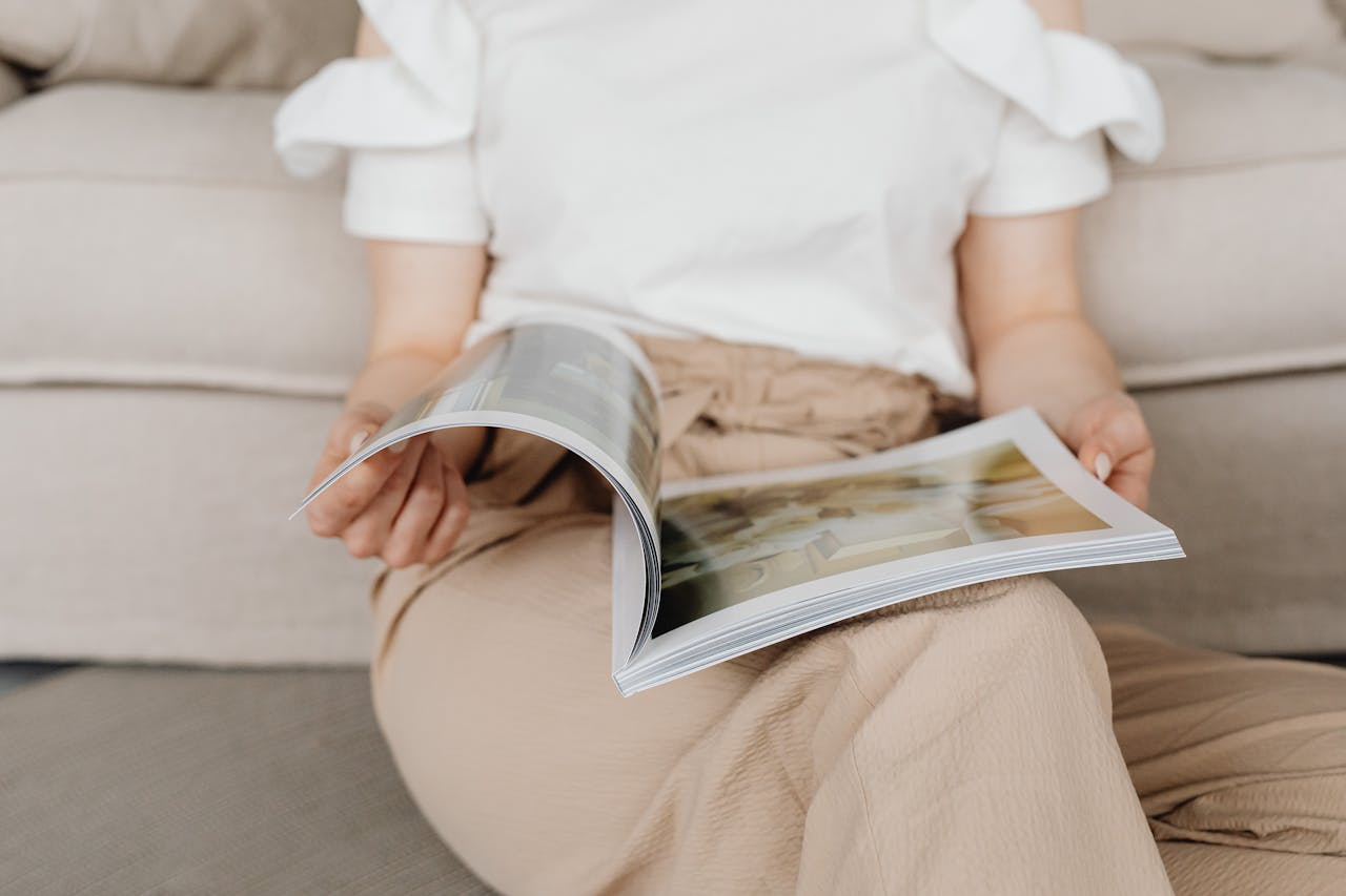
#5. Think in Spreads, Not Pages
One common mistake? Thinking in singles. Photobooks work best in spreads. Each left and right page should be in conversation, creating a visual dialogue. Pair wide shots with close-ups. Let colors echo across the fold. Balance compositions so the layout feels airy and intentional. At times, two seemingly unrelated images may share a shape, gesture, or texture—use those hidden connections to your advantage.
Ultimately, you’re not just arranging pictures; you’re building tension, rhythm, and flow. Think of it less as storage and more as styling—closer to a fashion editorial than an album.
#6. Curate Like You’re Casting
Think of your photobook as a production, not a dumping ground. Every image is a cast member, and only those that earn their place should make it to the stage and elevate your style. Strong lines, bold contrasts, undeniable presence—that’s the standard.
Editing is where the art happens. Not every shot belongs, and that’s not a weakness—it’s the point. Forty powerful pages will always captivate more than three hundred mediocre ones. So ask yourself: Does this image deserve the page? If the answer is no, archive it for another project.
And remember, subtle differences matter. Two nearly identical shots can tell entirely different stories. Study the details—the way light falls, a gesture, a shift in mood—and choose the frame that speaks loudest. That’s how you elevate a collection into a statement.
#7. Add Personal Notes, But Keep Them Tight
Captions can add depth, but restraint is key. A street name, a date, a single word—just enough to ground the image without weighing it down. Keep them discreet: small type in a corner, almost an afterthought. They should whisper, not shout. Think of captions as clues, subtle signposts that guide the viewer while leaving room for interpretation.
#8. Remember: Cover Choices Matter
When learning how to create a photobook, remember that your cover sets the tone. Don’t weaken your work with a dull or cluttered design. Instead, choose a striking image—a face, a shadow, or a wide shot with negative space that leaves room for a title. Opt for clean typography and avoid decorative fonts or clip art. Often, the most powerful covers are the simplest: a single commanding image or even a blank field with the title quietly tucked into a corner.
#9. Use Tools That Respect Design
You don’t need to be a professional designer to create elegance, but you do need the right tools. Platforms like Blurb, Artifact Uprising, and MILK Books provide grids, templates, and just enough control to guide you without overwhelming the process. Avoid the temptation of auto-fill layouts; they often feel chaotic and careless. Likewise, resist gimmicky effects and flashy page transitions that distract from the images. Instead, keep it clean. Every spread should feel intentional, considered, and worthy of the space it occupies.
#10. Publish It or Print One
Finally, decide how far to take it. You can print a single copy for yourself, or you can print several and treat them like a small run. If you choose the latter, keep everything sharp and minimal. This isn’t a scrapbook—it’s a design object, something that could be sold or gifted.
Some people document weddings, others a summer abroad, others a season of protest. Whatever your story, tell it with intention. Design it like an editor, package it like a book, and let it hold not just your images but the attention of anyone who picks it up. That’s the essence of how to create a photobook that feels as striking and timeless as a high-fashion editorial.
Featured Image: AndreyPopov/iStock
For the latest in fashion, lifestyle, and culture, follow us on Instagram @StyleRave_
—Read also